
Visualising your course design
In the rush each semester to get a course ready and available for students in time, it is tempting to simply follow the course outline from previous years and make a few tweaks here and there, even perhaps in an effort to improve the student experience. The focus is often on adequately covering course content and summative assessments, but it is better to look at the course or program systematically to see the student experience holistically from beginning to end. This is where mapping of a course or program to learning outcomes and graduate attributes can help by revealing the student journey week to week.
A new perspective brings new insights
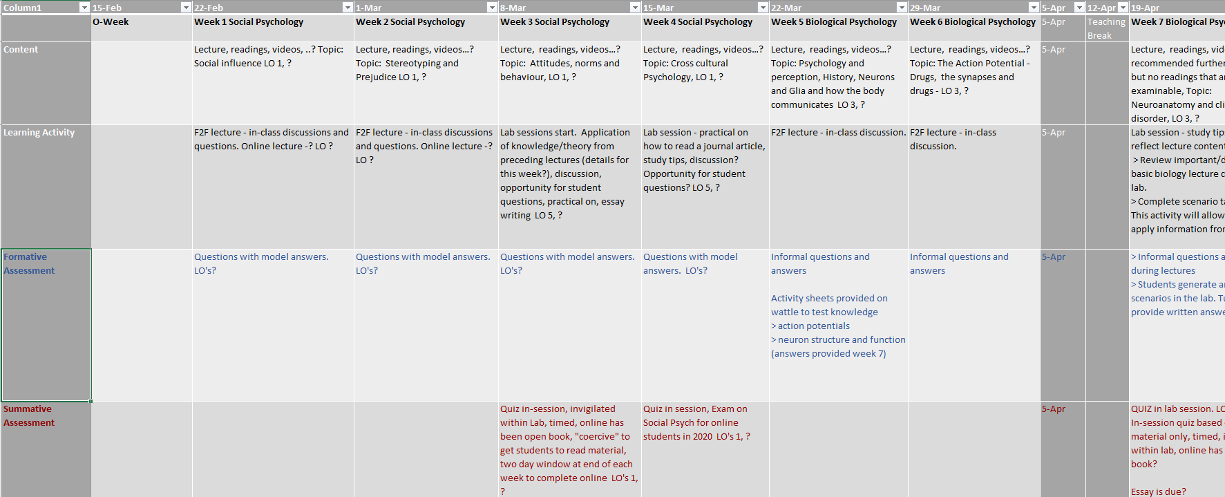
It can be a shock when teaching teams take the time to map their course design along a timeline. For example, by mapping a timeline of the course in Excel, lecturers have been made keenly aware of the placement of assessments through the semester, and the relationship of these assessment dates to other courses in the program being undertaken. Often there is the realisation of the stress that students are under meeting deadlines for summative assessments and studying for high stakes exams across all courses in a program. The upside is that using such an exercise, it is often very apparent what needs to be done to rationalise assessments, provide more opportunities for feedback, and lessen exam stress.
Overview of tools and methods for visualising your course

Using a visual mapping approach to designing a program or course is a team effort. It puts academics and teaching staff into the role of designing the student experience to maximise learning. The process is to workshop the design as a group, to decide how the students will gain skills and knowledge and demonstrate their attainments. There are numerous ways to provide a visual expression of a course and its activities, contents and assessments. Here are some examples:
- Using multiple whiteboards/walls and large sticky notes
- Excel spreadsheets can provide a way to create a simple timeline of a course with the weeks mapped out and activities, content and assessments added at the appropriate week or date.
- Microsoft Planner using “buckets” columns for courses or topics/weeks within courses and assessment

- Trello using cards (Trello is a versatile web-based team tool for collaboration and planning)

- Padlet (is web-based and uses movable virtual sticky notes)
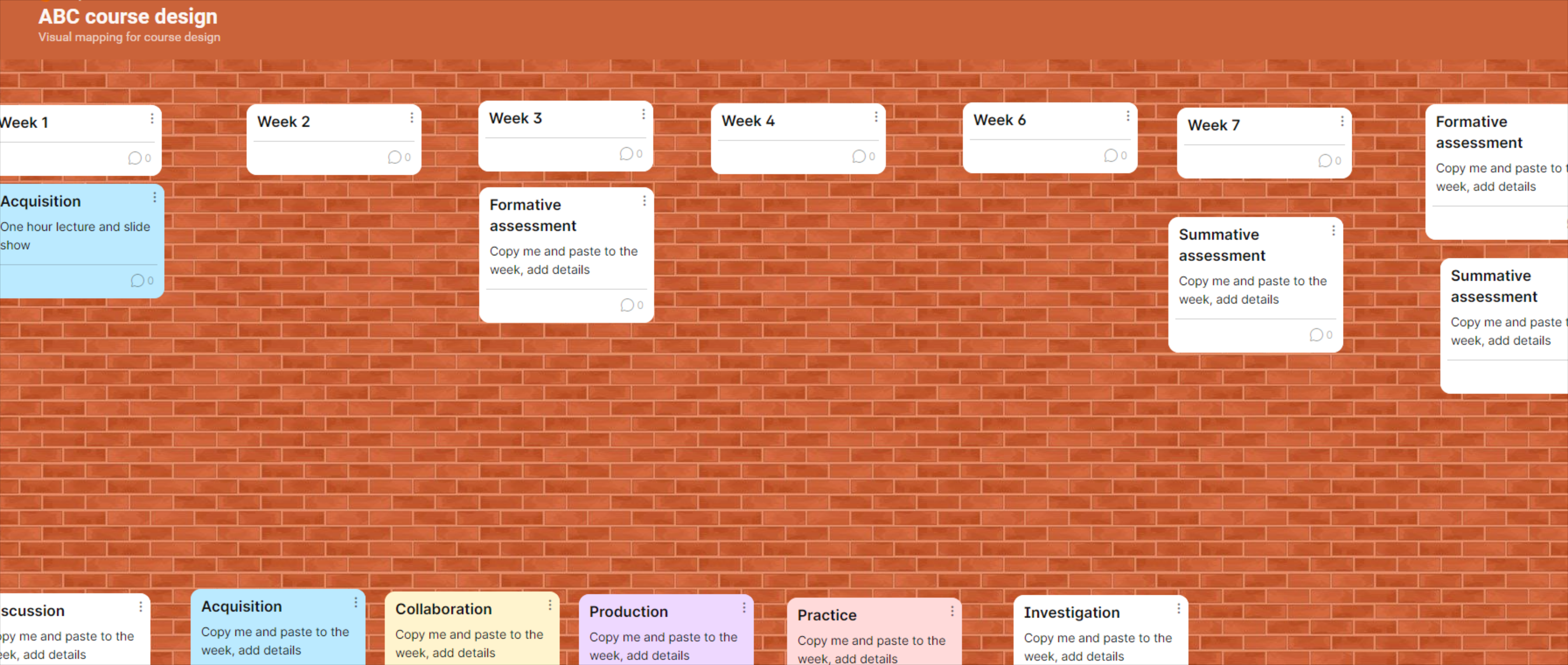
- Learning Designer tool (a free online tool specifically designed by University College of London for teachers to use in designing their course using the “ABC” design method)

Like more information?
In September, ASCILITE and TELedvisors ran a webinar on Visual methods for curriculum and course design, in which two academics, Dr Dewa Wardak and Dr Andrew Cram from the University of Sydney demonstrated the tools they use to develop a visual representation of their course or program. Later, Mitchell Osmond from UTS spoke on Visualising the Curriculum.
To find out about the ABC model of course design, based on the work of Diana Laurillard, and download the toolkit, go to ABC Learning Design.
Try it yourself!
Here are two courses that provide training in using the ABC method of course design:
- University College of London Blended and Online Learning Design (this will give you access to a free Designer tool, in which you can map your course and export an analytical report showing what type of mix of activities your course relies on for students to learn.)
- Western University, California – ABC Online Course Design workshop – this provides a series of video tutorials and a link to a Trello example, which you are able to copy and edit to try it out for yourself.
Reference
Find out more about Diana Laurillard’s thinking in this e-Book available through ANU Library – “Teaching as a Design Science: Building Pedagogical Patterns for Learning and Technology”
https://ebookcentral-proquest-com.virtual.anu.edu.au/lib/anu/detail.action?docID=957058
October 2021
Jill Lyall is an Education Designer in the Education Design team at the Centre for Learning and Teaching.